Tile Shape & Pattern Options
Tiles are made in a multitude of shapes, colors, textures, and sizes. Choosing the right size and layout is important to achieve the desired look and atmosphere of any space. Here are some contemporary examples of shapes and layouts.
STACKED
This is a basic layout for rectangular or square tiles. Tiles are arranged in a grid horizontally or vertically that break away from the more common running bond seen with masonry brick work. A stacked bond offers a clean and modern look to a bathroom or kitchen backsplash.
1/3 OFFSET
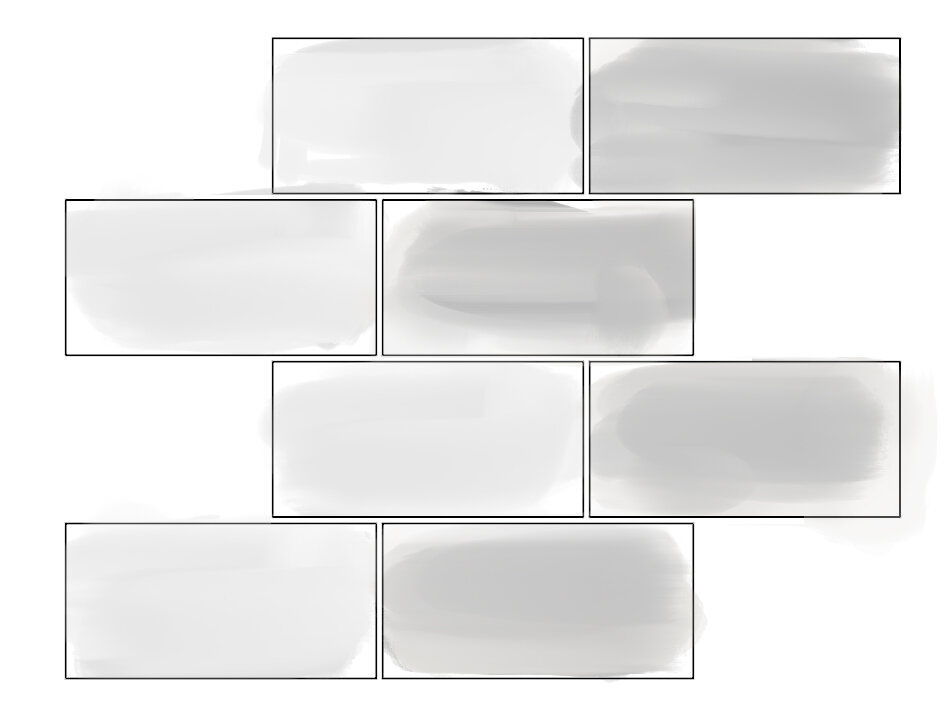
This style offers a variation of the running bond. Tiles are staggered at 1/3 of their length and grout lines become more integrated into the diagonal effect. Small format tiles with two or more different colors provide for a striking appearance.
HERRINGBONE
Not to be confused with the chevron, the herringbone is laid in V-shaped rows of 45-degree angled tiles. This style offers a graphic way to make a common rectangular tile more visually appealing. Introducing contrasting grout lines highlight the design.
CHEVRON
The timeless chevron layout utilizes a diamond or polygonal shaped tile. The layout is commonly used with two different colored tiles. Same or different colored tiles are matched on their vertical ends for a continuous or broken zig-zag along the surface.
GEOMETRIC - CUBE
Rhombus shaped tiles are arranged to give the illusion of a three-dimensional cube. This style plays with visual texture while remaining on a two-dimensional plane. To enhance the visual effect of light and shadow, two to three different colors are used. While this layout is common, there are many variations of the layout with multiple geometric complexities.
Kitchen Elevation
For our Tremont Residence project tile has been a large part of our material choice discussion and will be the main material in a few spaces. These interior elevations will help the tile installer arrange the tiles in a way that align fixtures with grout lines, minimize irregular cuts, and maximize the space's appeal.
In the kitchen, we'll use a white, glossy subway tile laid in the herringbone pattern. As this wall is open and largely uninterrupted, a graphical use of tile will add interest to the refined yet simple color palette that we're working with.
Guest Bathroom Elevation
The master bathroom will showcase a glazed, ocean-blue rectangular tile vertically stacked. The guest bathroom features a similar tile horizontally stacked. These simple-shaped tiles are energized through their vibrant color, texture, and quality. During our material selection process, we found that stylistically linking these spaces together would strengthen the architecture of the house as a whole.
Master Bathroom Elevation


