Mechanical Mirrors
Daniel Rozin's "Wooden Mirror" used mechanical and digital means to create stunning effects. His latest, "Angles Mirror" is a variation on that same theme. Part of me wants to say "Great, little spinning lines." The other part of me wants to watch it for hours.
Do Ho Suh: Staircase III
I was at the Tate Modern a couple of years ago and saw the installation "Staircase III" by Do Ho Suh. It is a recreation from the artist's memories of his NY apartment.
Despite its simplicity, it is an immediately arresting work. Your initial experience of it is seeing the light diffused through the red fabric. Then you realize that there is some structure to it--stairs, handrails, doorknobs. Then you start marveling at the technical aspects of recreating all of this in fabric. Where the fabric can't keep up with the "real" items, it droops and sags, with the effect being poignant and reflective rather than distracting. The forms are all leftovers, voids, imperfect impressions.
Check out the video at the Tate website, also.
“The space I’m interested in is not only a physical one, but an intangible, metaphorical, and psychological one,”
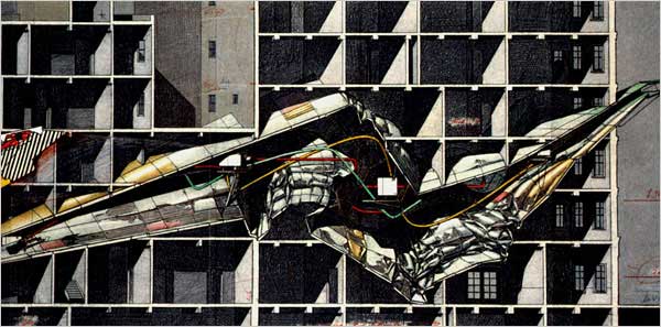
Lebeus Woods: A reminder of why I'm an architect
Many people ask "so, when did you decide you wanted to be an architect?" I usually respond with something vague and noncommittal, along the lines of "Oh, I don't know, it just seemed like it would be interesting..."
But. The death of Lebeus Woods last year reminded me that he is why I wanted to be an architect. I remember going to the bookstores as a kid to find his books and look at the drawings. I had no idea what they were, or what they represented, but I was hooked. They were different, mysterious, and, frankly, cool.
I can't say that my design sensibility is anywhere close to his, or that it ever was, but his work was the inspiration that got me started.
Sodastream Refrigerator
Samsung has a new refrigerator with a built-in Sodastream. Frankly, plain water from a fridge always seemed redundant, with the kitchen faucet all of 2 feet away. But carbonated water from a fridge sounds like a godsend.
Architectural Covers
I'm a big fan of architecture that looks like other architecture. Thus, I really like Post Post. It's true that one could get bent out of shape over the "ripping off" of a design, but I'd rather think of them as architectural covers. Johnny Cash's version of "Hurt" is just as good as the NIN original (feel free to disagree). Similarly, re-iterations of buildings echo each other but are never truly identical.
“Imitate.
Don’t be shy about it. Try to get as close as you can. You’ll never get all the way, and the separation might be truly remarkable... ”
MOCA Cleveland
I visited the new Museum of Contemporary Art last week for a quick lookaround. It definitely has a striking, well executed exterior, even if the reality of it doesn't exactly match what the renderings and presentation drawings showed.
There isn't much of a lobby, and you get the sense that this is a space where artists work , and the public is allowed to have a chance to peek in on them. It also reinforces the impression that the museum is primarily a black jewel, and that considerations about inhabiting it are somewhat secondary. This isn't necessarily a bad thing, but it does mean that the experience is very different from the Met or Guggenheim museums in NYC where you know that you're in the lobby.
Ultimately, it's a great building and will hopefully stimulate future work to be as ambitious and elegant.


